Walk the Talk Consulting
The Situation
An expert in organisational culture, launching a consultancy that needed to look like one worth hiring.
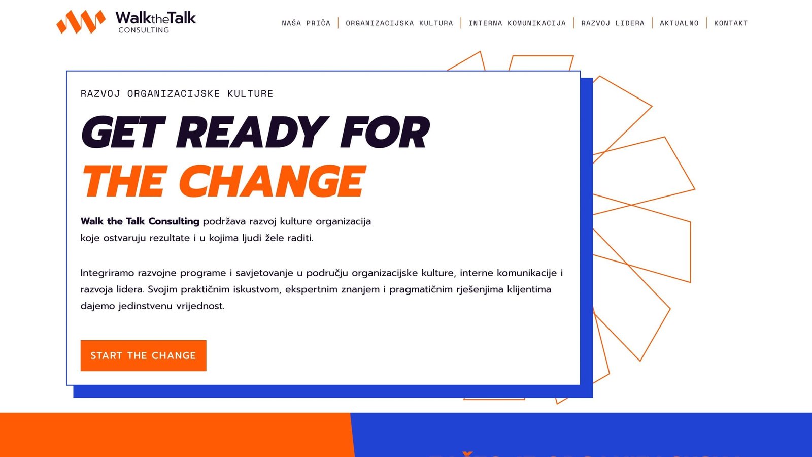
Nina Butić Ivanković spent 20 years in senior corporate positions focused on organisational culture and internal communications before launching Walk the Talk Consulting. She had the credentials — Denison Certified Practitioner, award-winning culture transformation projects, clients from Heineken to SOS Dječje selo — but no brand and no web presence. The brief was clear: this couldn't look like another grey consulting firm with stock photos and corporate jargon. She wanted energy, colour, a visual language with a point of view. Her references ranged from Accenture and IDEO to Croatian poster design and Nick Cave.
The work
Brutalist structure, constructivist energy.
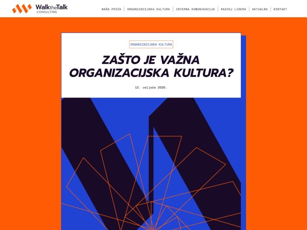
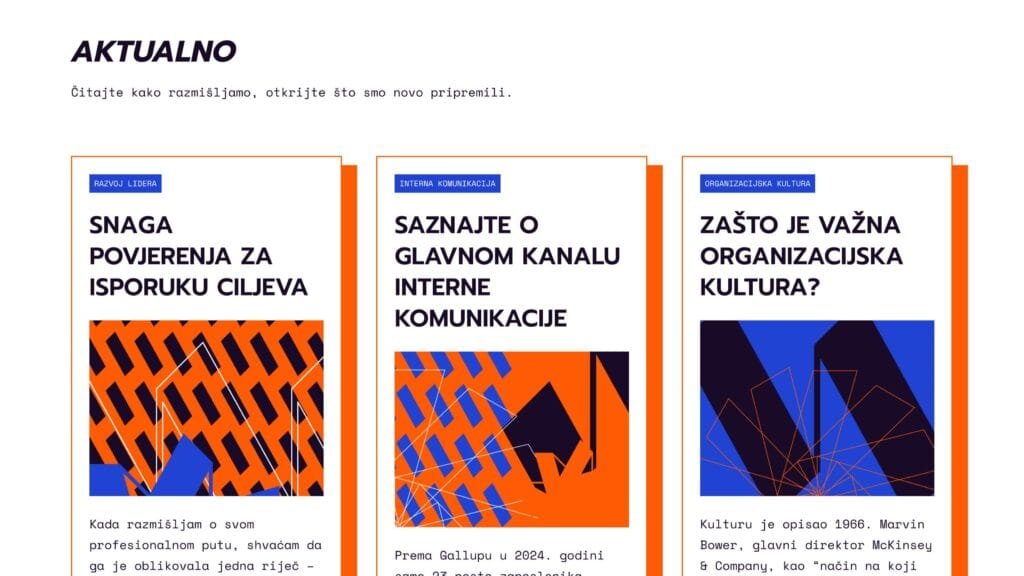
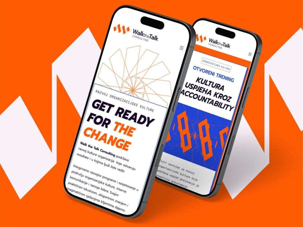
We agreed early on to push the visual direction somewhere unexpected for a consulting brand. The identity landed in a brutalist-constructivist space — bold geometry, a sharp orange and deep blue palette, and a graphic system built from a single element. The logo mark is a movement pattern derived from the letter W — a rhythmic, repeating form that evokes walking, talking, sound waves. That same fragment multiplies and rotates across the entire visual system: it becomes texture, pattern, background, frame. One element, endless variations.
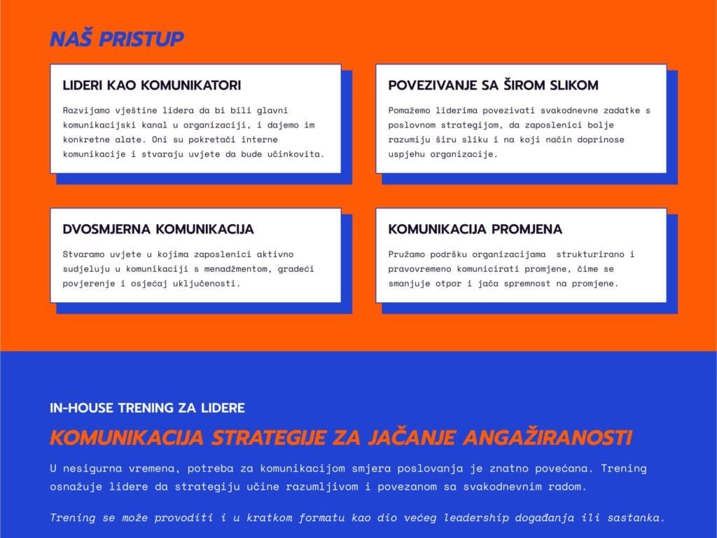
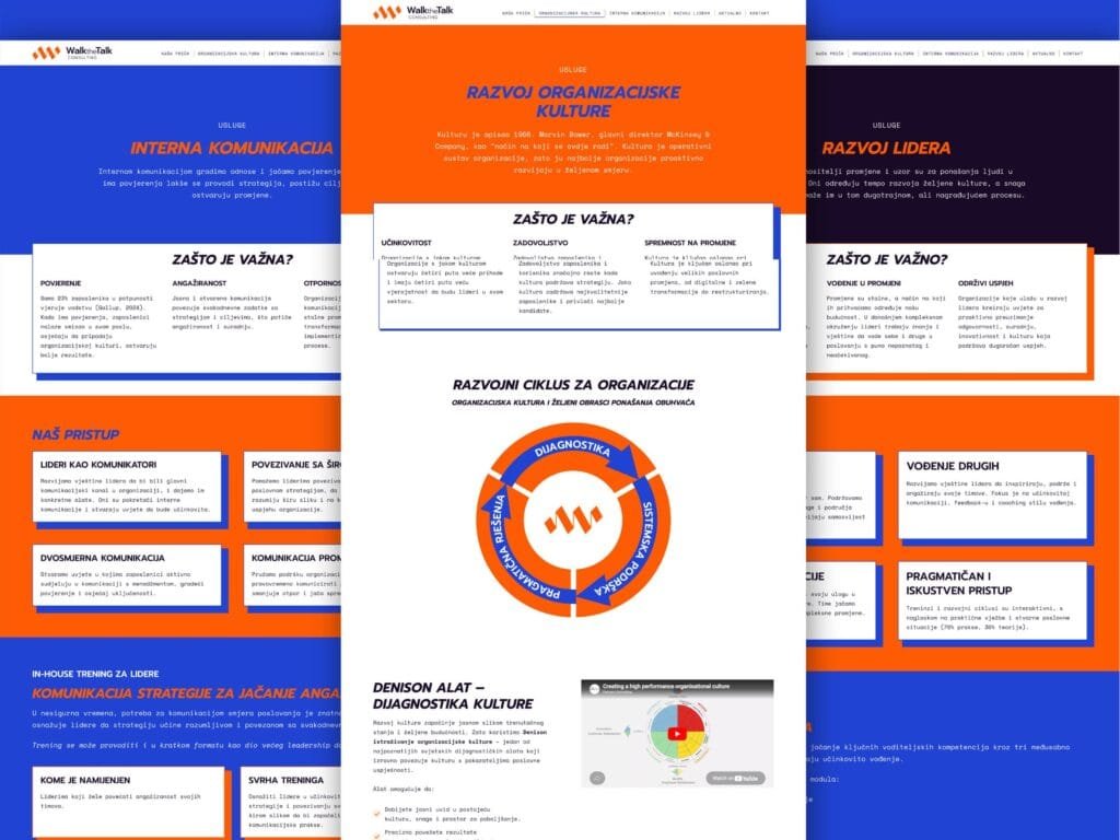
The website follows the same energy. Strong colour blocks, direct messaging, and a structure that reflects how Nina works: organisational culture, internal communications, and leadership development as three clear service tracks. The content positions Walk the Talk as something the Croatian market hasn't really seen — a consultancy that takes culture seriously as a business driver, not as HR wallpaper.
We challenged each other throughout. She pushed me to give the design more creative freedom. I pushed her to make the content structure tighter and the copy more concise. The result is stronger because neither of us settled.
The result
A brand that practises what it preaches.
Walk the Talk Consulting now has an identity and a site that do exactly what Nina helps her clients do: align what you say with what you actually are. The visual language is distinctive enough to stand out in a market dominated by safe, forgettable consulting brands. The site is built on WordPress so Nina can publish articles, add client references, and grow the content as the practice scales.
"Working with Bor is easy and the communication relaxed, even though we've never met in person. The aesthetics of his web design are simple yet distinctive, unique. We challenged each other — he pushed me to make the site structure and copy clearer and more concise, and I pushed him to give the creativity more room. The result is a bullseye."
Next Project
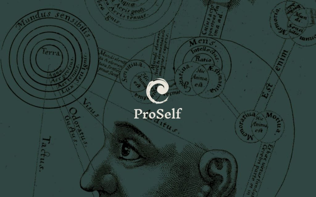
Proself
Visual identity and website for a Gestalt psychotherapist. A logo merging a spiral with a Zen Enso circle, and a site as grounded as the therapeutic work itself.